Job at a Startup👩🏻💻
Transforming the InterviewBuddy Website to Mobile App to Drive Sales

My Contribution
Timeline
5 months
Role
UX Designer
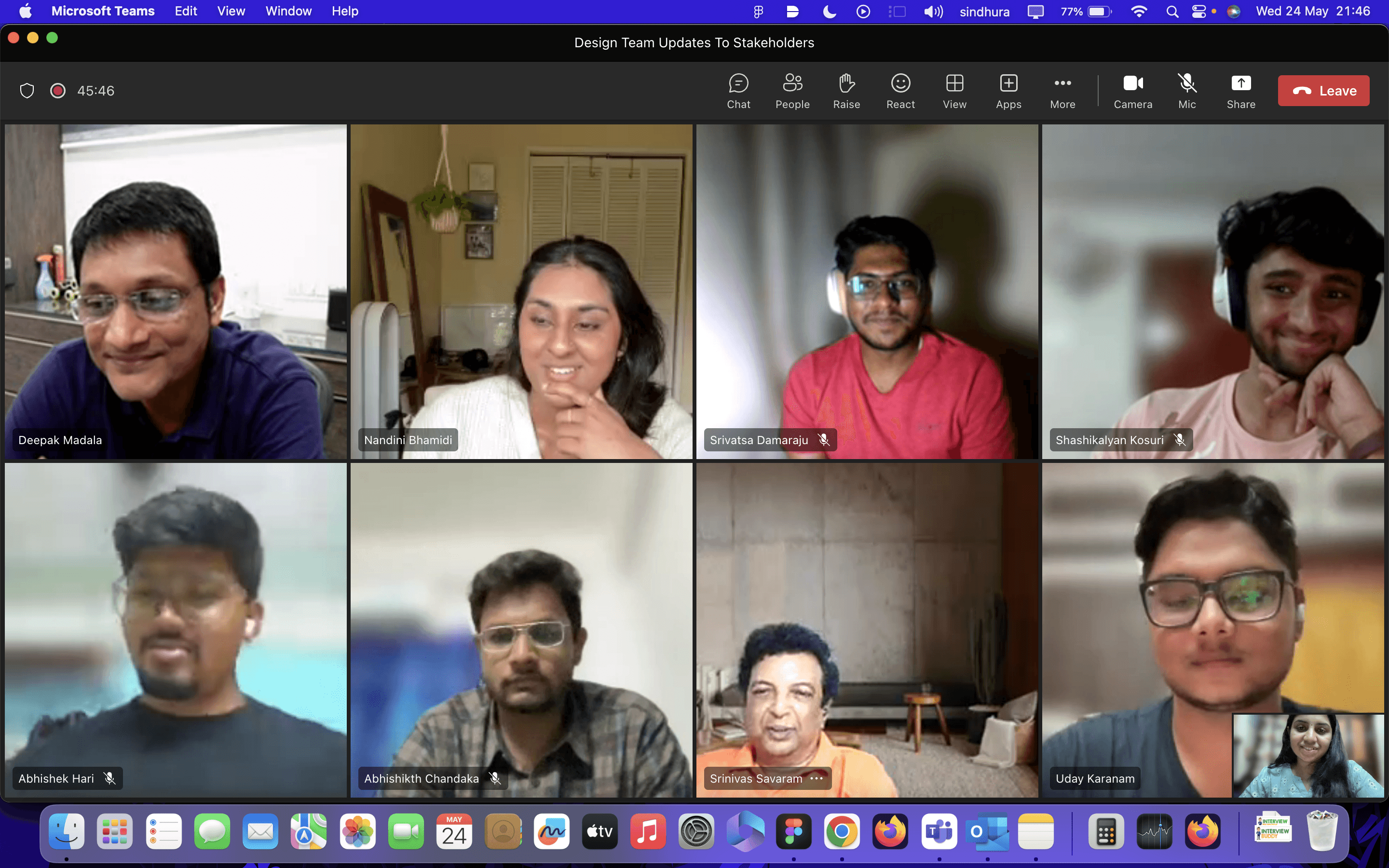
Team
Me and 1 other Designer, Lead Design Mentor, Product Manager, Engineering Manager, 2 developers
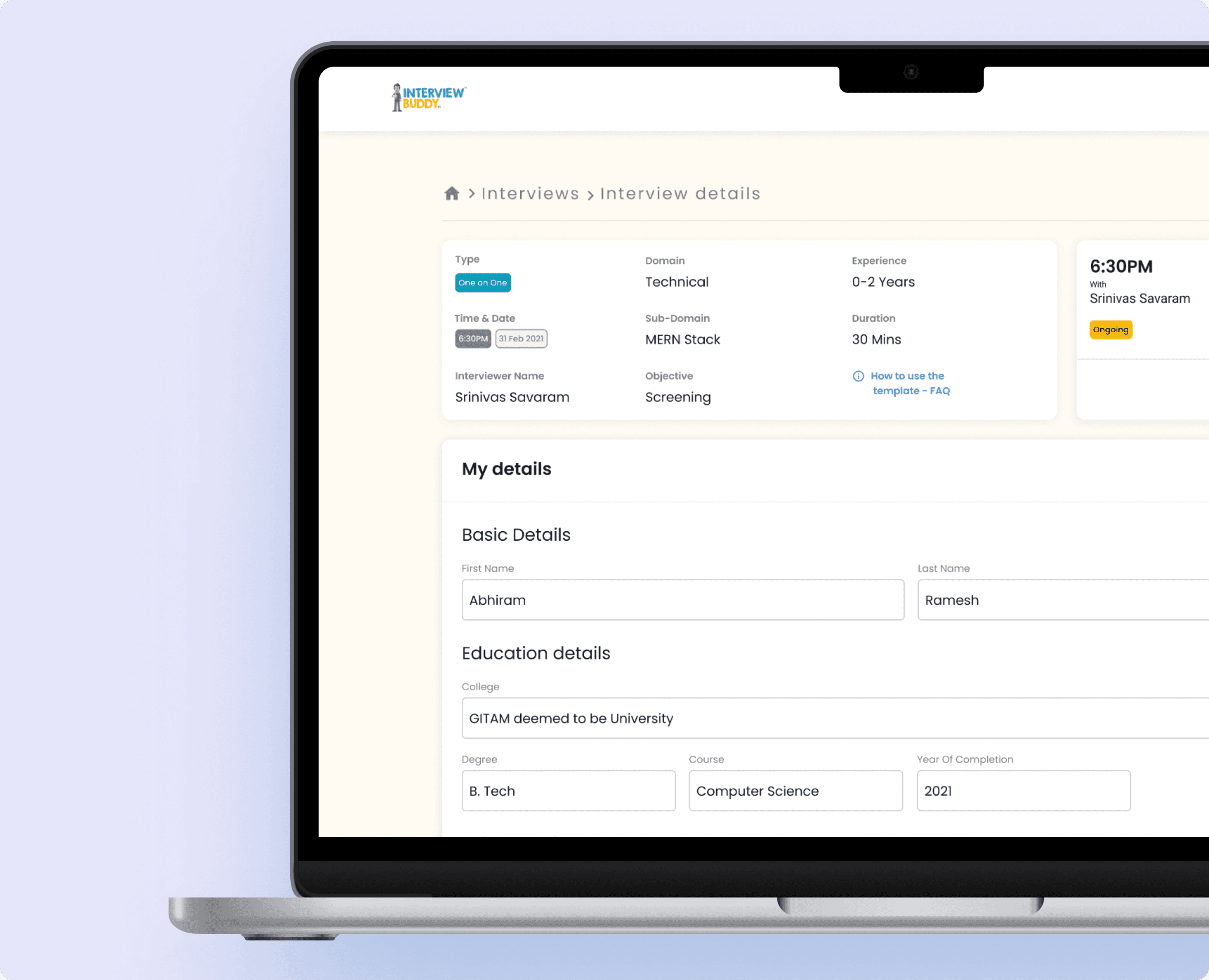
What is InterviewBuddy?
Understanding the current status of the product
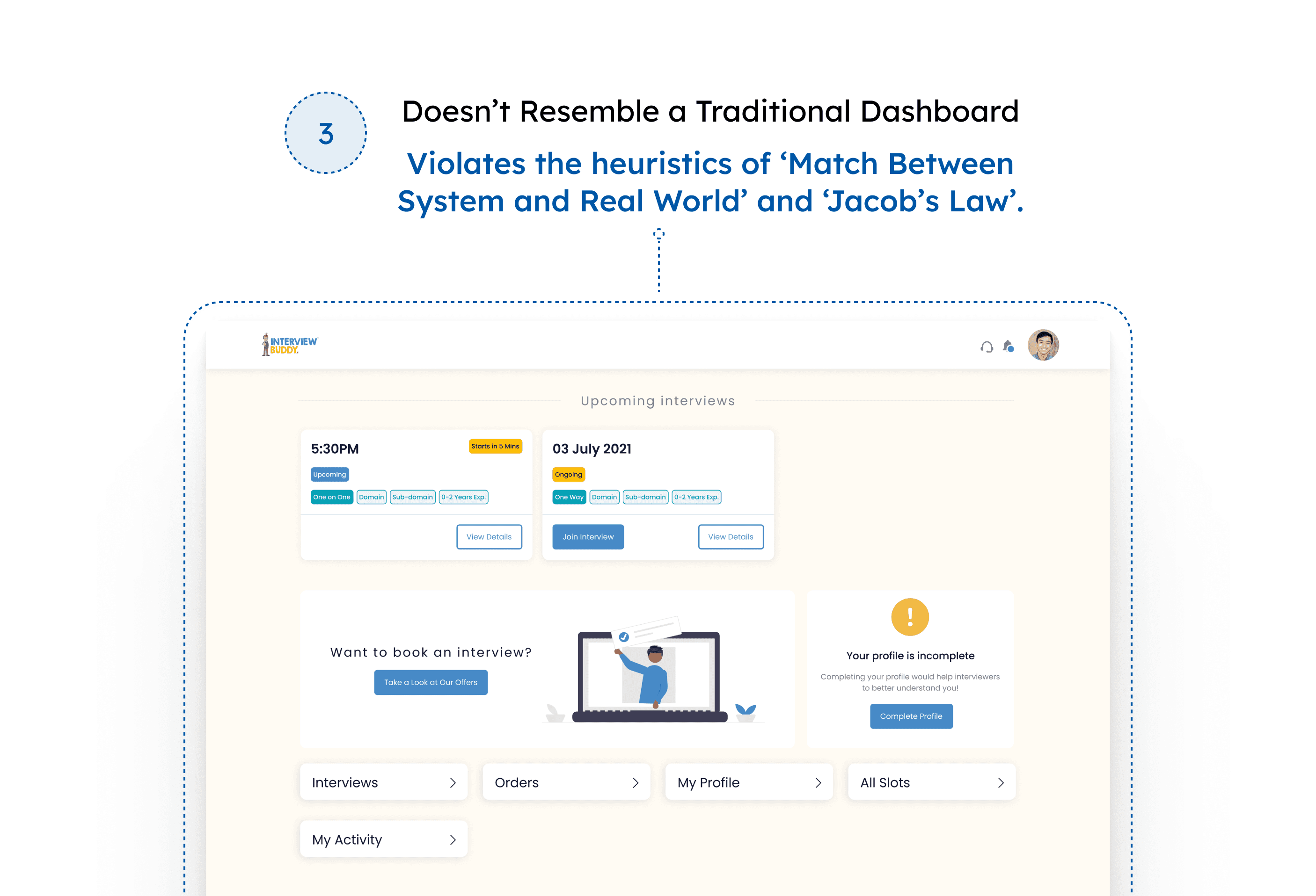
Why did the beta-launch fail?
Limited Mobile Accessibility
Inefficient User Experience

We realized it was time to step back and reflect.
Explorative research
Exploration aimed at understanding the pain points.
Admin
"I wish there were an easier way to manage all this data; the navigation is quite difficult."
Candidate
"As a student, I often don’t have my laptop with me, and I prefer working with a mobile interface."
Interviewer
"The interface contains a lot of information, making it very difficult to grasp data, especially when I'm switching between calls quickly. This should be easier."
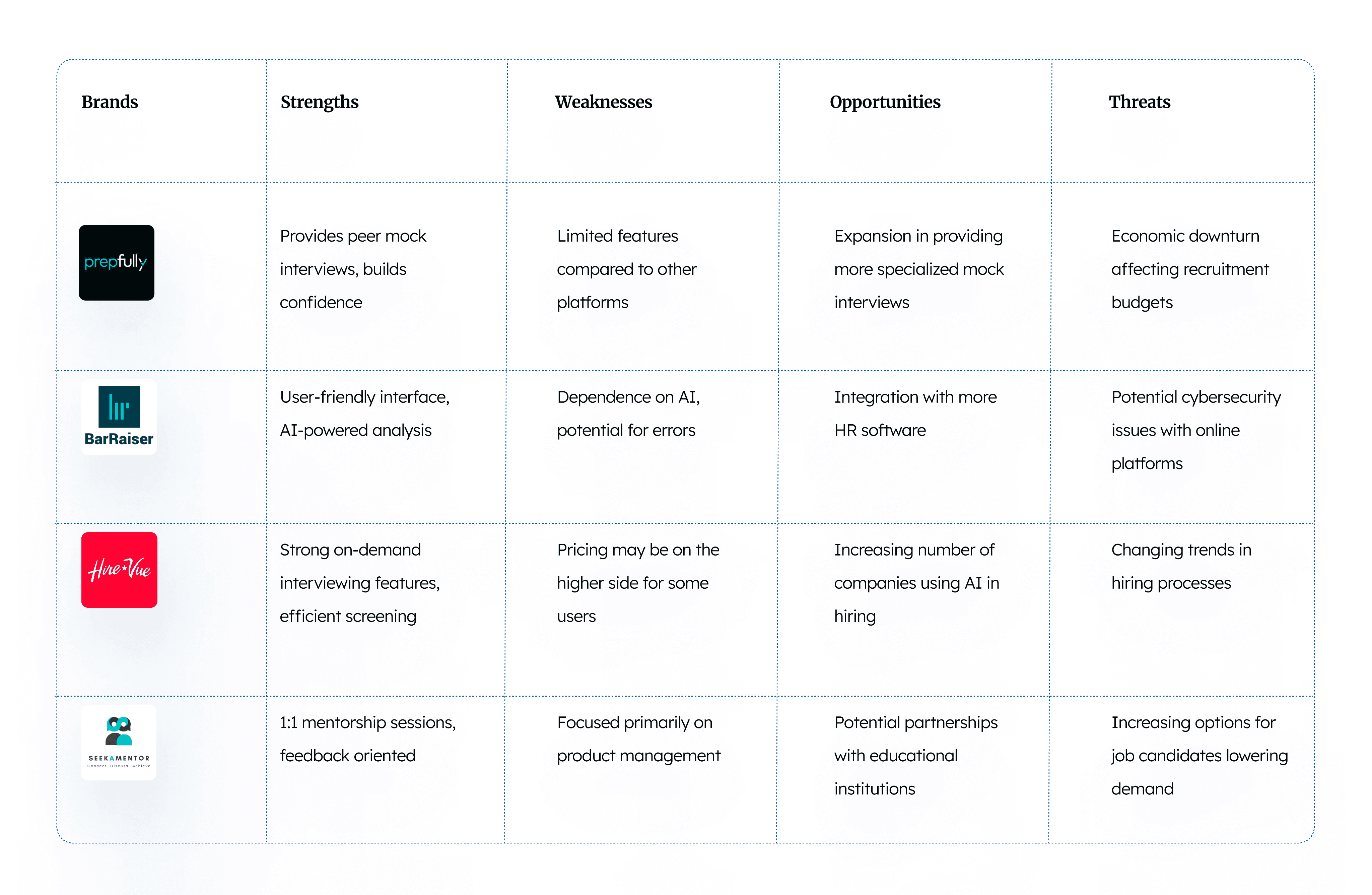
Forming Consensus and Strategy
Constraints
Constraints we had to keep in mind before approaching the process
Which gave us the realization that
We may have to use our existing resources and interface to build a product which made us arrive at a concept called.
RETROSPECTIVE RESEARCH
which is evaluating the current state of the product and building off of it.
Retrospective Research
Content Inventory
We created a content inventory with all the information from the current website version.
Prioritizing Content
As we had to work with smaller real estate pixels we had to make sure we prioritized the content we'd be placing. This involved various discussions with stakeholders and within the teams.
Identifying A Visual Hierarchy
Once we have sorted out your content, it was time to craft a visual hierarchy to guide us along your design process
Identifying Navigational Items
We clearly mapped out all the essential points users need to get to and mapped them out to be in our navigation.
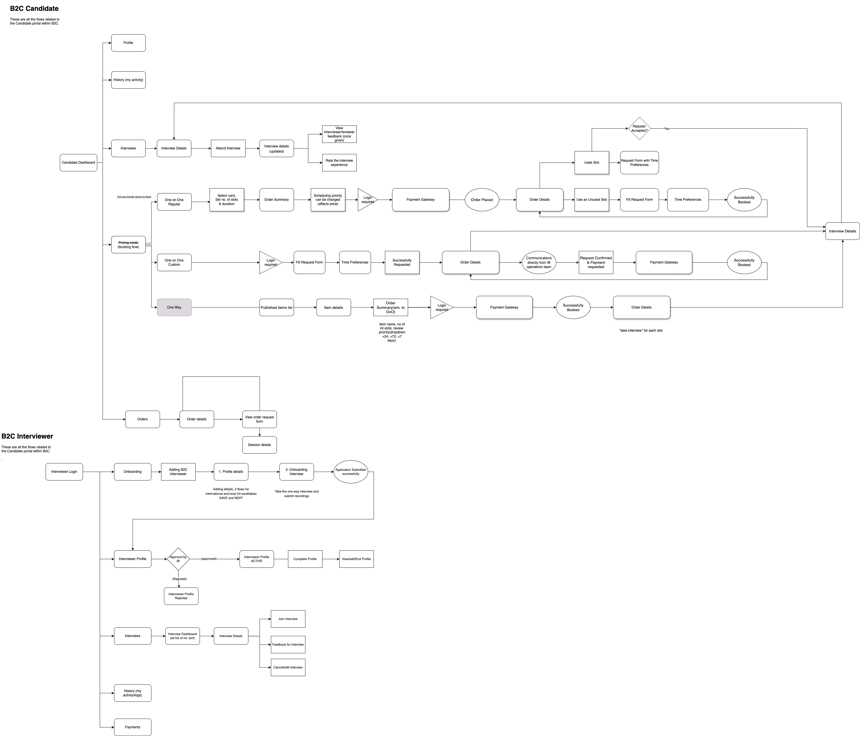
Consolidation
Bringing everything together
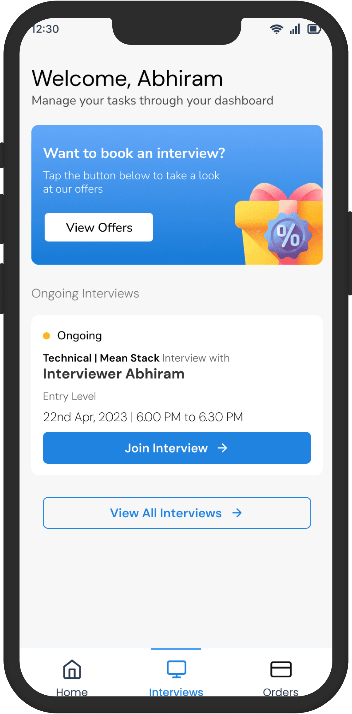
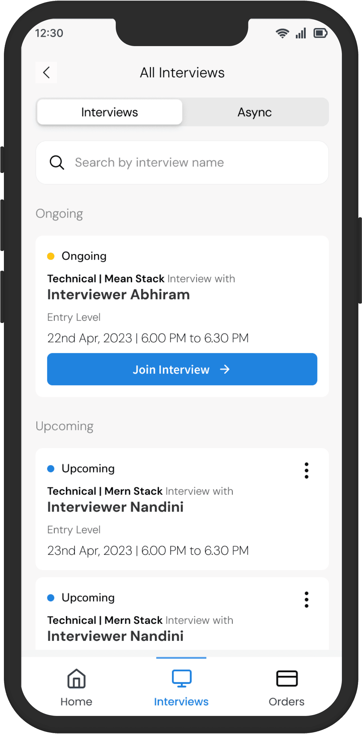
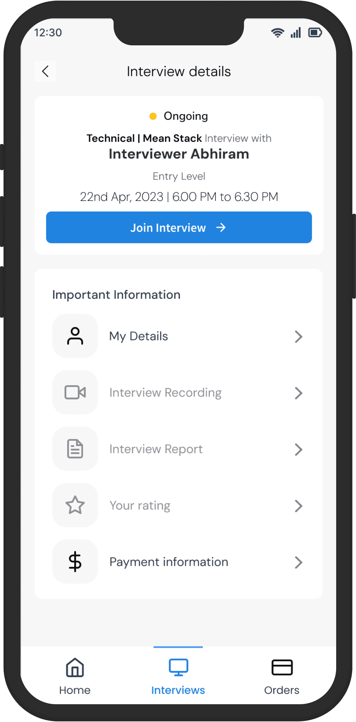
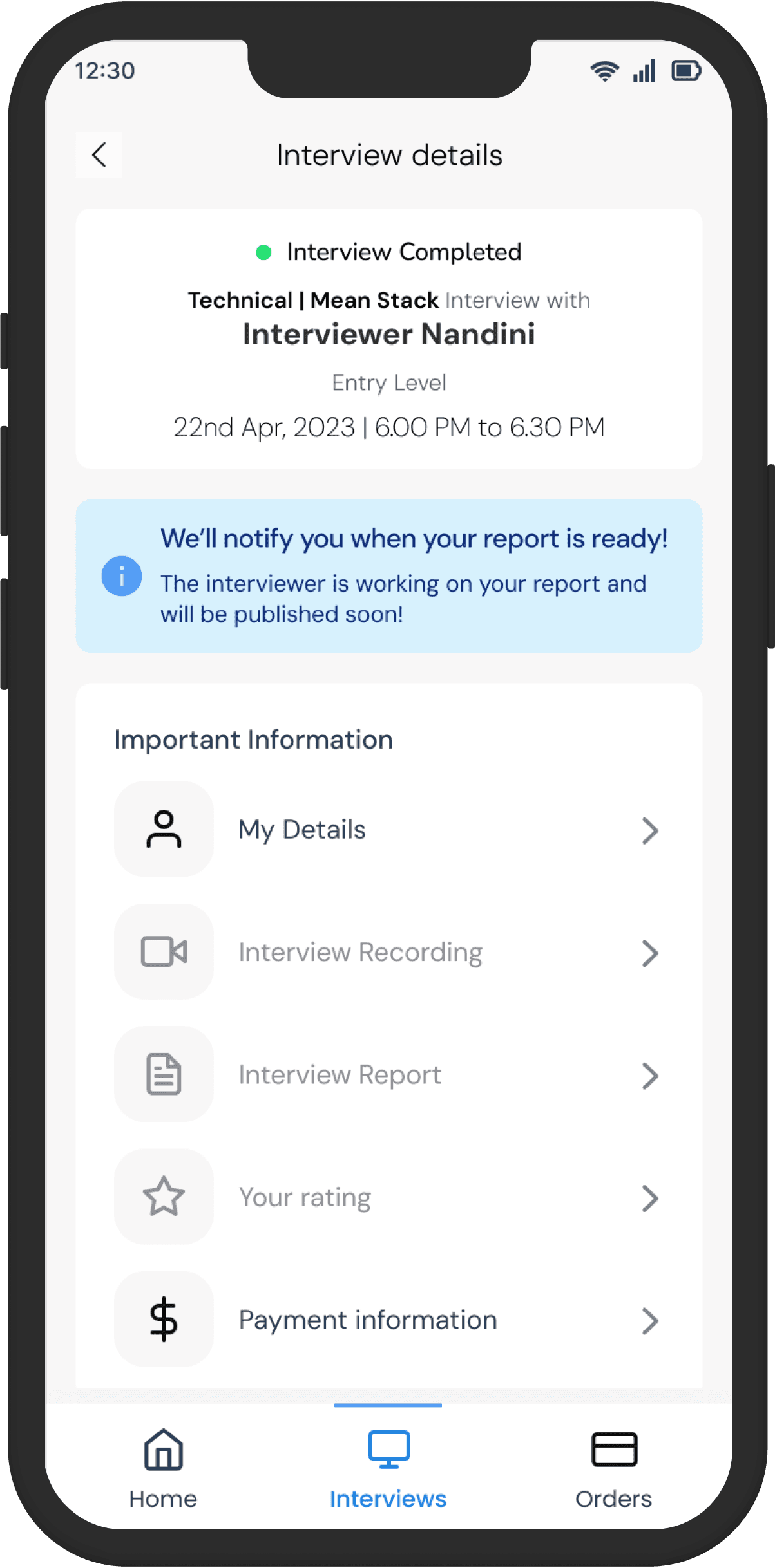
The initial designs
Rough wireframes to map out layouts
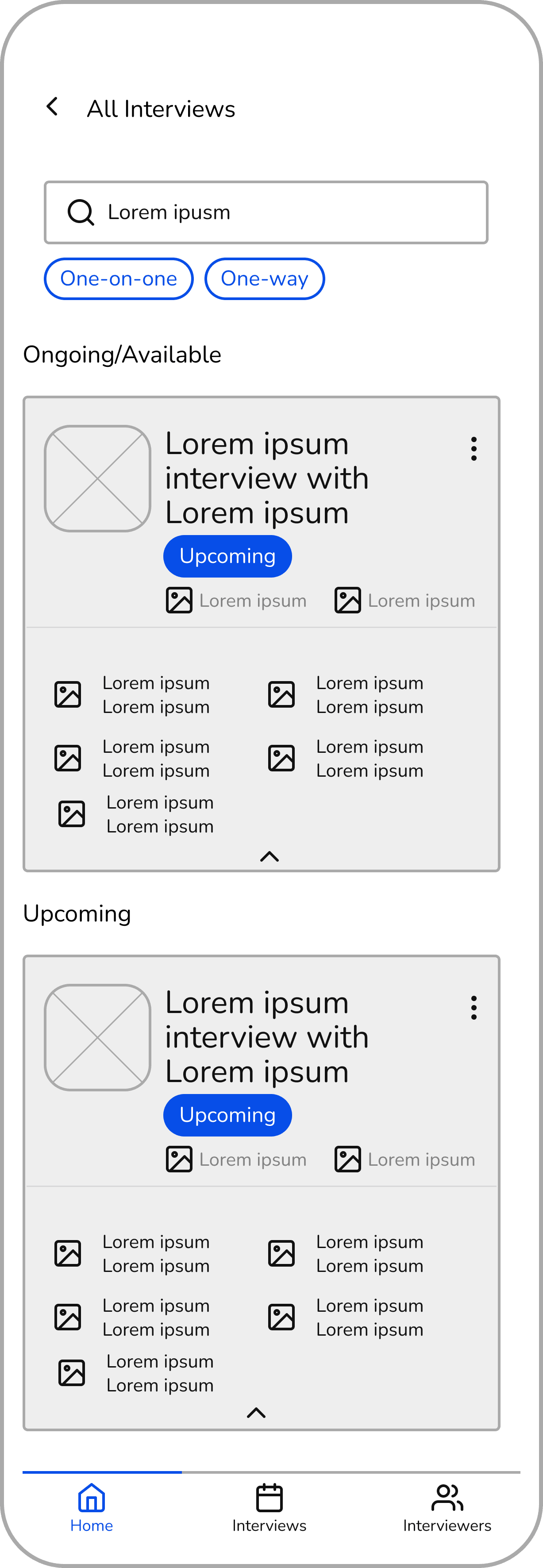
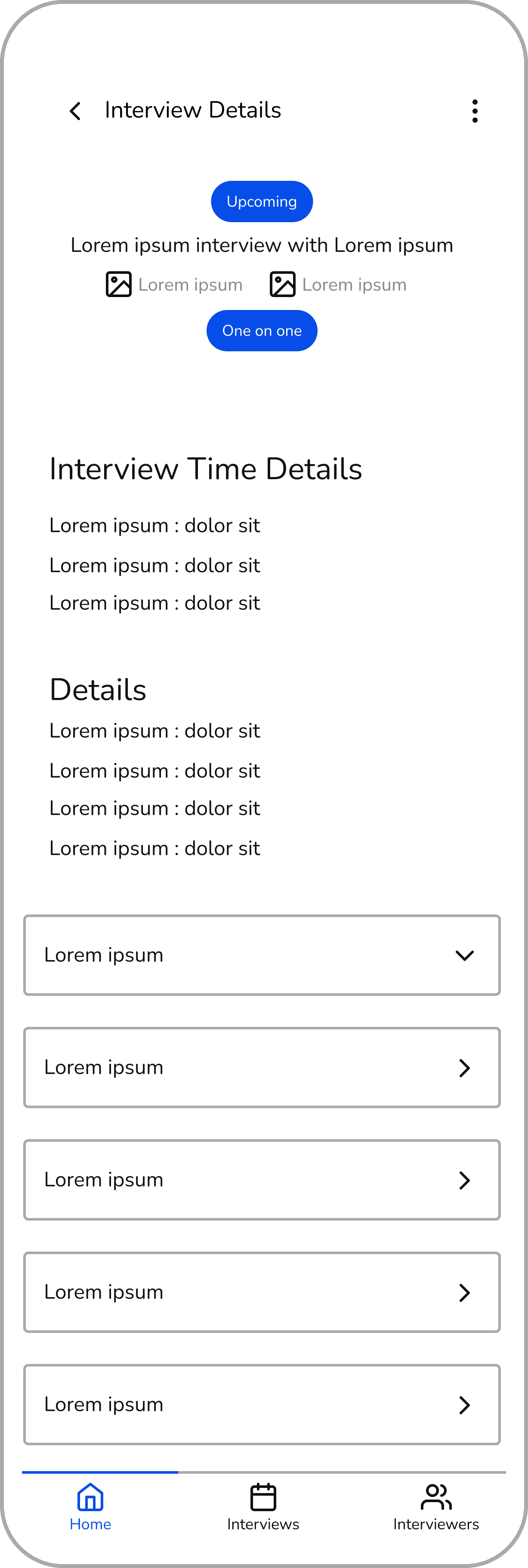

Mid-Fidelity designs to be used for testing
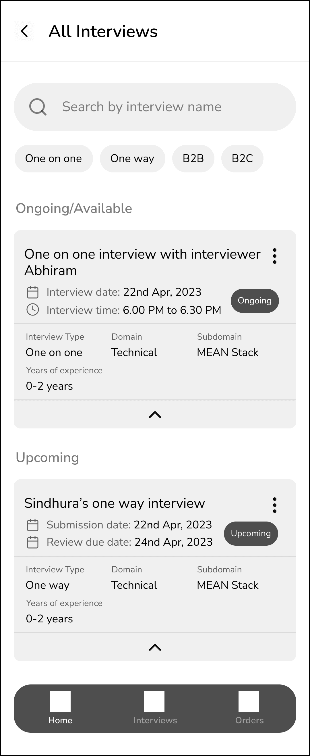
Testing the product out
What did the users say?
6/6
Participants
6/6
Participants
5/6
Participants
4/6
Participants

We immediately prioritised our tasks and fixed them
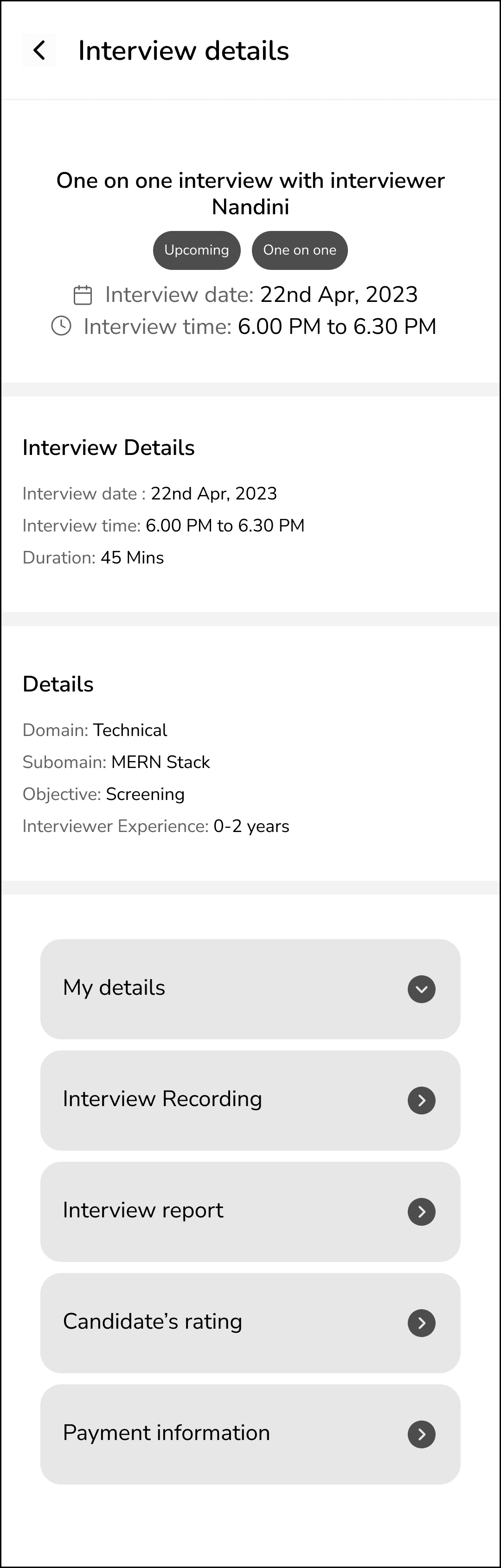
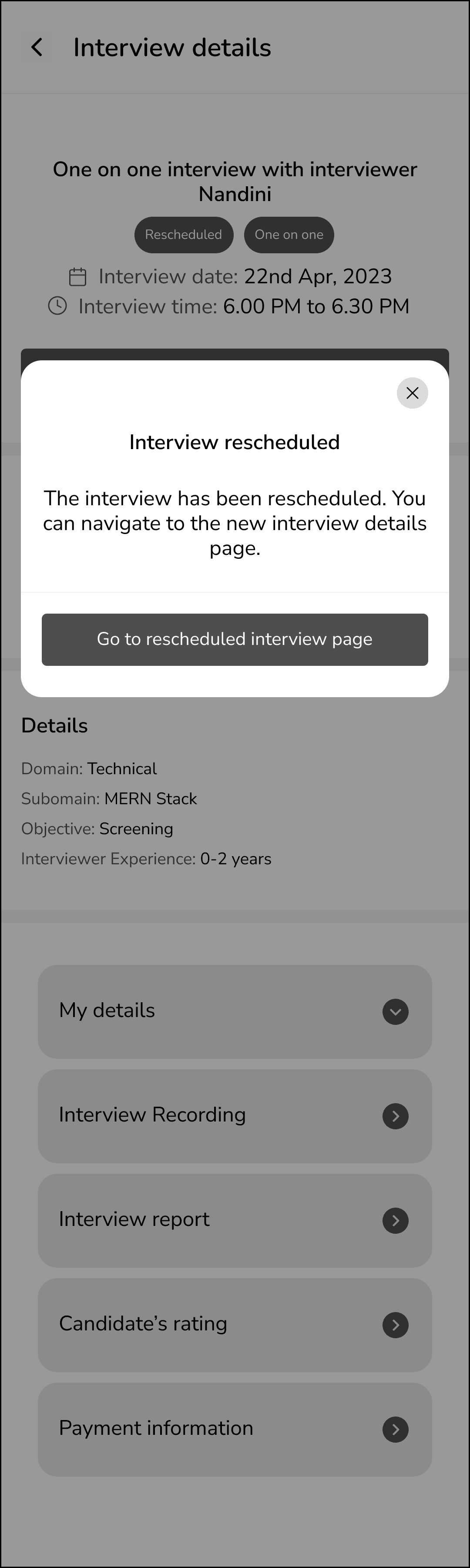
Final Designs
Finalized High-Fidelity Designs
A few more screens protected under NDA
The Team
The amazing people I worked with to make this happen!